
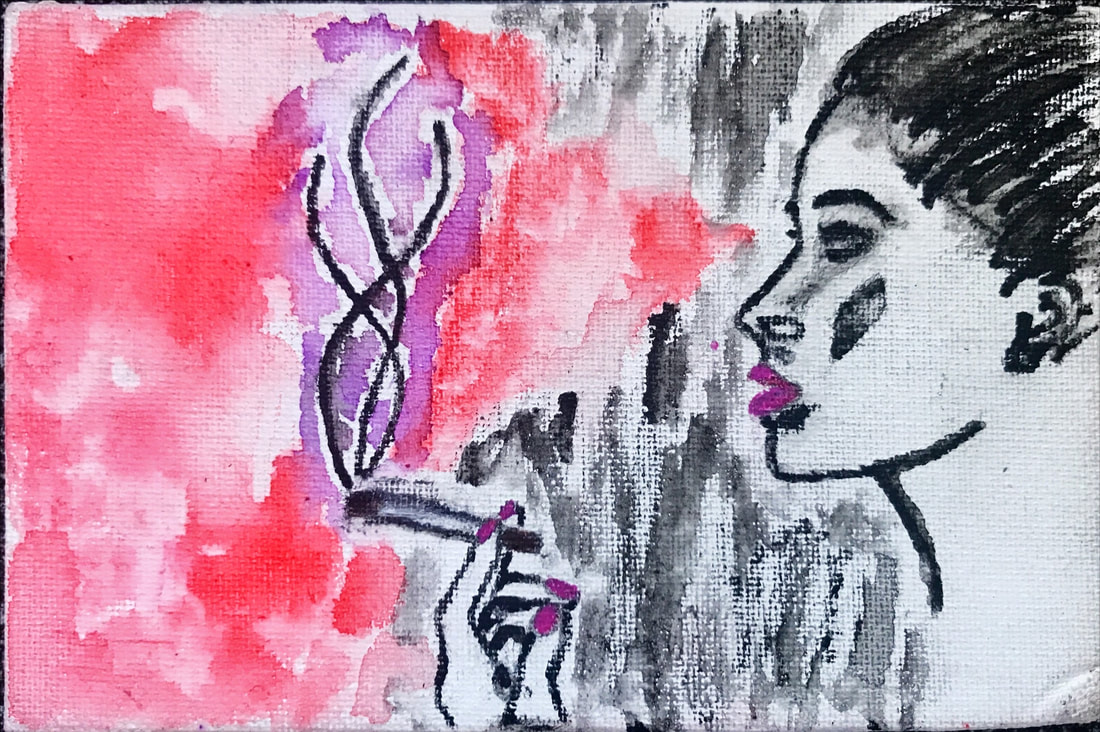
In creating this water color, which explores themes of fragility, transition, and the female gaze, I was mostly inspired by the following lines from Elizabeth Bishop’s poem, “The Filling Station”:
“oil-soaked, oil-permeated
to a disturbing, over-all
black translucency.
Be careful with that match!” (Bishop 3-6)
These lines were particularly significant to me because they conjured lots of visual imagery that I carried with me throughout the rest of the poem; as a result, I came to view these lines as the undercurrent of the poem (I will return to these lines in more detail). Overall, my aim for this water color was to convey the thought process of the female viewer/narrator of the poem as she views the filling station, through color, symbolism, emotion, and direction/placement.
A key aspect of Bishop’s poem is the way in which the female viewer/narrator’s view of the filling station transitions, changes, and develops. Initially, her focus is the “oil-soaked, oil-permeated" setting, which she describes as dirty to the point of disturbance. With this image comes the notion of masculinity - particularly with the entrance of the “several quick saucy and greasy sons” in the second stanza (I will return to the idea of masculinity). Within the next few stanzas, however, the viewer begins to take note of the colored comic book, the dog, the house plant, and the doily; objects which embody a homey, familial environment filled with love and care. By the end of the poem, the viewer tenderly remarks the way in which somebody takes care of the filling station to make it into the environment of love that it is.
“Somebody embroidered the doily.
Somebody waters the plant,
…
Somebody loves us all.” (34, 35, 41)
I represented the narrators transition as a viewer in my art, through my use of color and direction. The right half of the watercolor is mostly black and white, embodying the viewer’s initial perception of the filling station, while the left half is permeated with bright reds and pinks, reminiscent of the life and love the family breathes into the filling station – something that is initially imperceptible, but upon a second glance or an acknowledgement of details, becomes very clear.
While important in itself, this theme of change and transition, especially in terms of the way in which a viewer or audience views a subject, has even more significant undertones. The driving idea behind my creation of this work was the notion of the female gaze – that despite initial overwhelming masculinity, a feminine hand permeates the poem. As a result, I chose to make the female viewer the subject of the artwork, rather than the filling station itself. Red color in this work, which visually and emotionally overtakes the black and white, symbolic of masculinity, is projected from the eyes of the viewer – an artistic choice I made to call attention to the power of the female gaze. I also used pink color to accentuate the feminine aspects of the viewer, her lips and nails, which are the closest points to the cigarette as the women holds and smokes it. I was extremely interested in connecting femininity and the cigarette, because I wanted to symbolize female power and freedom in the 1960s (very important to consider the poem and its symbols in the context of the time).
I will now circle back to the lines in “The Filling Station” that inspired this work. In relation the female gaze, another concept I was particularly interested in was fragility. The viewer’s narration of her thought process conjures an image of an “oil-soaked” and “oil-permeated” landscape. We can envision a car of women pull up to the filling station and light a cigarette. Now here, there is significance in the inclusion of “Be careful with that match!” because in just one instance, with the dropping of a match, the female viewer could ignite and destroy the oil-soaked image over which she gazes. Hence, the flames from the match or the cigarette smoke not only embody the way in which the female gaze is empowering for women, but also the way in which it makes masculinity a fragile, delicate, and breakable thing. This power of the female gaze is emphasized in the poem in the way in which the viewer very much questions, judges, and maybe even indirectly criticizes the lives of the people (mostly men) who live at the station. Visually, I once again used color to emphasize the significance of the cigarette smoke (because I did not include flames in which art work), by surrounding it with a more purple-pink color.
Overall, this water color explores various interconnected topics of Elizabeth Bishop’s “The Filling Station”. We can look at the red, left-half space of the art work as the loving, caring, and familial aspects of the station, or as the female gaze permeating the filling station, setting fire to a fragile masculinity.
 RSS Feed
